Maximum file size: 50MB
Make your photos look like cool posters
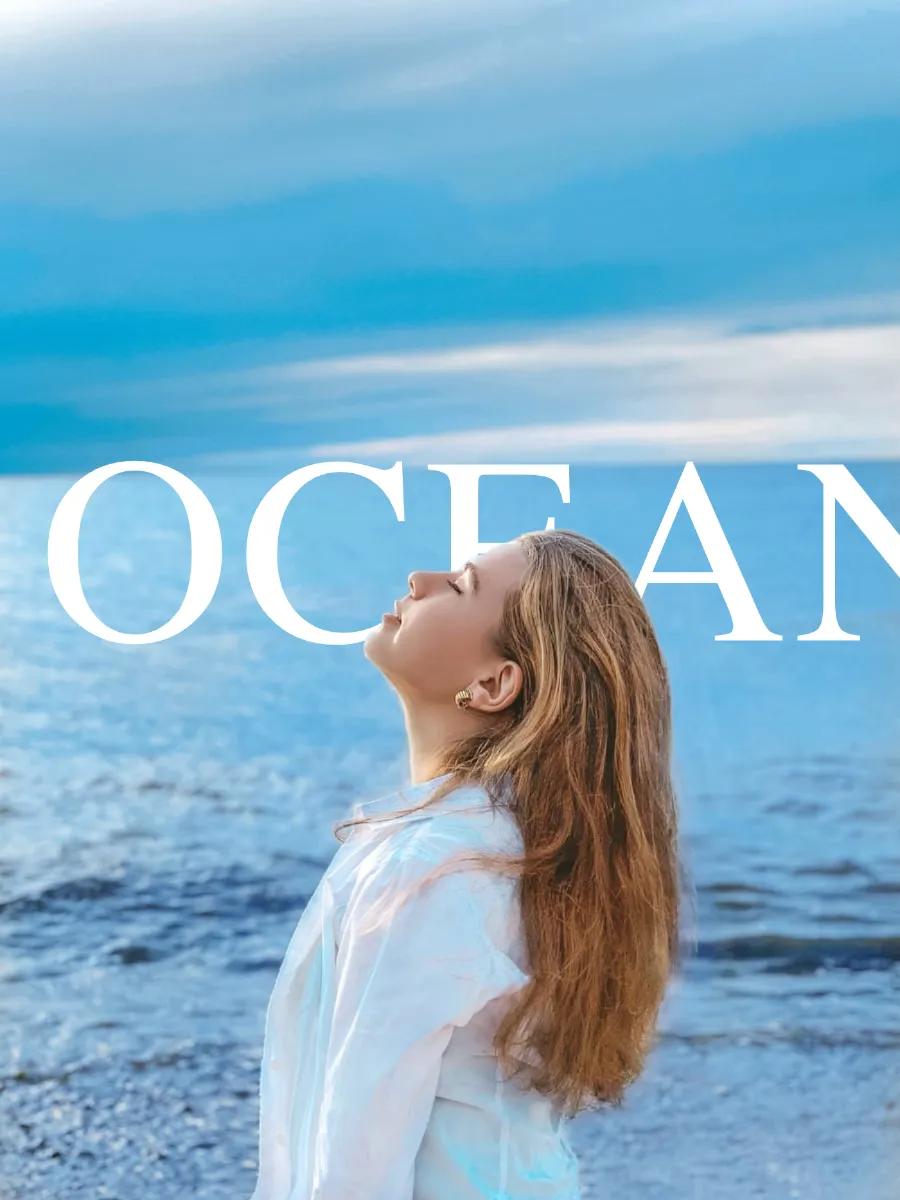
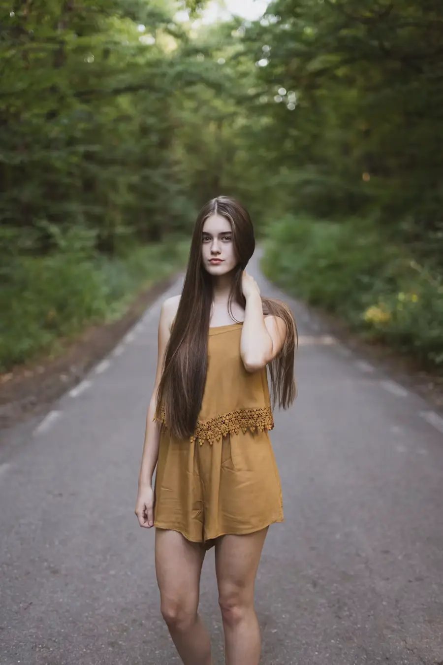
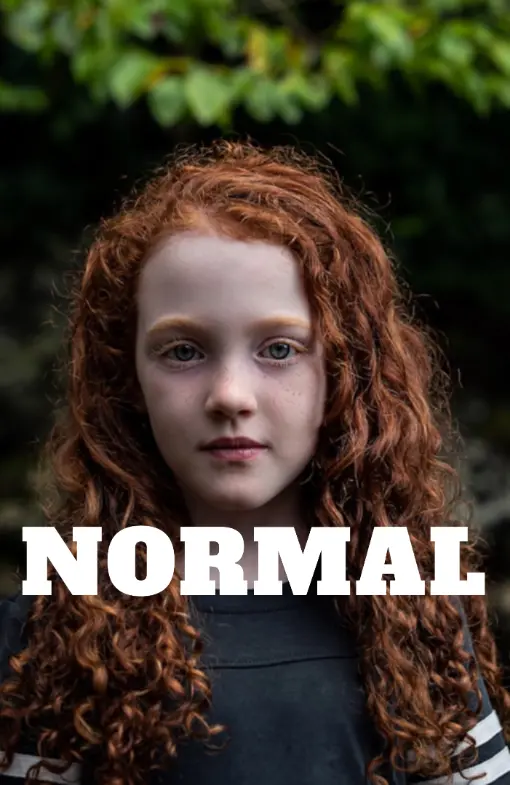
Drop your photo onto the editor or click to pick a file. Use a photo with a clear subject — a person, a product, a plant, or any object. The AI scans the photo and separates the subject from the background right away. Both JPEG and PNG work fine.
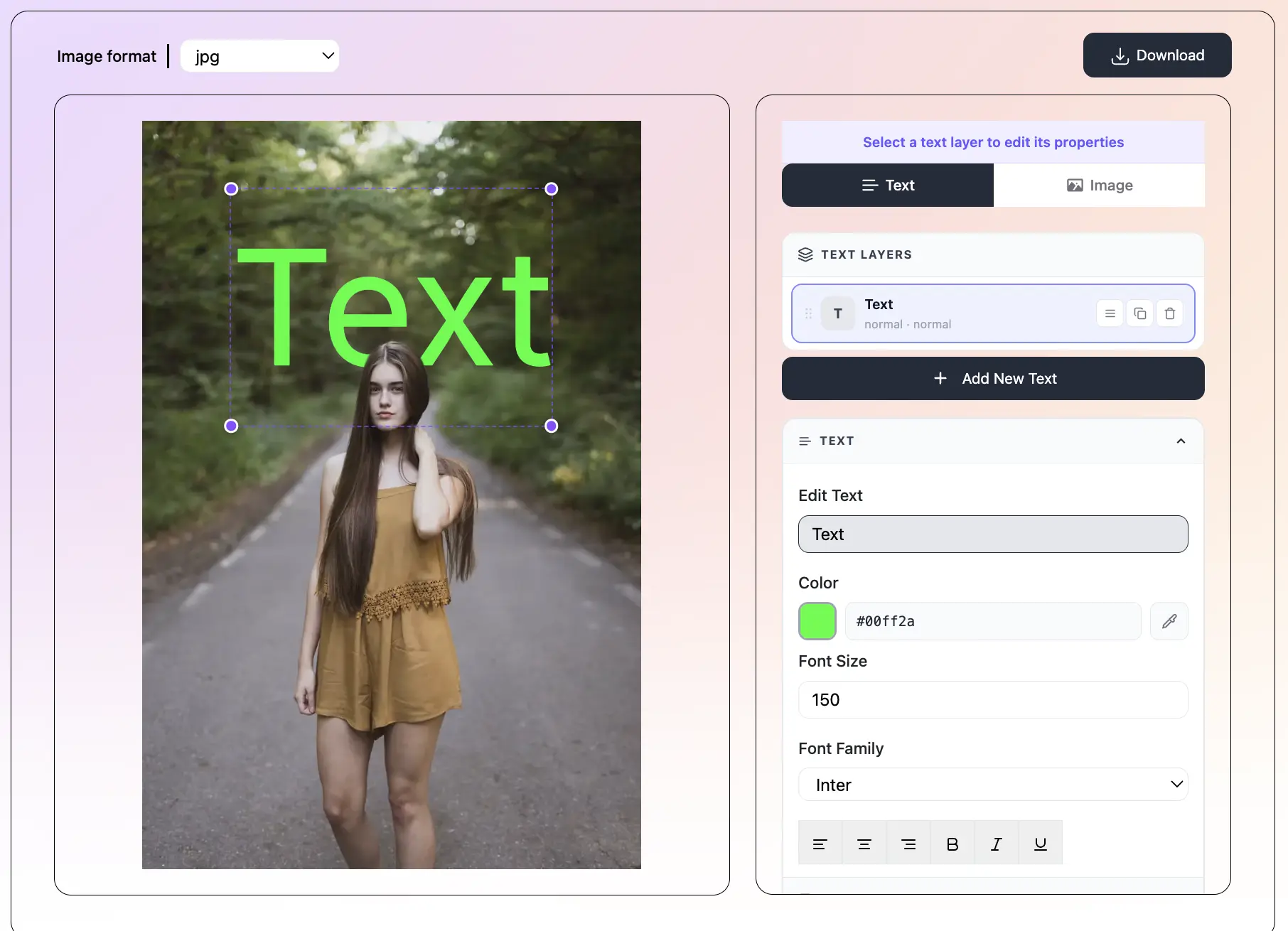
Click Add Text and type your pin title, quote, or call to action. Pick a font from the 150+ options and choose a size that fills the pin nicely. Use one of the 36 presets to get a fully styled look in one click — font, color, and effect all at once.
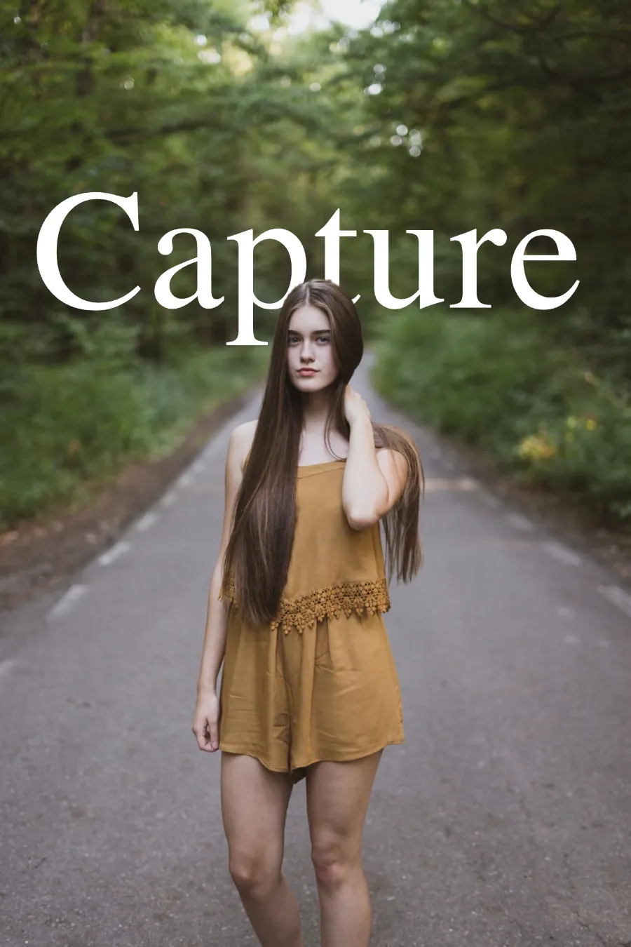
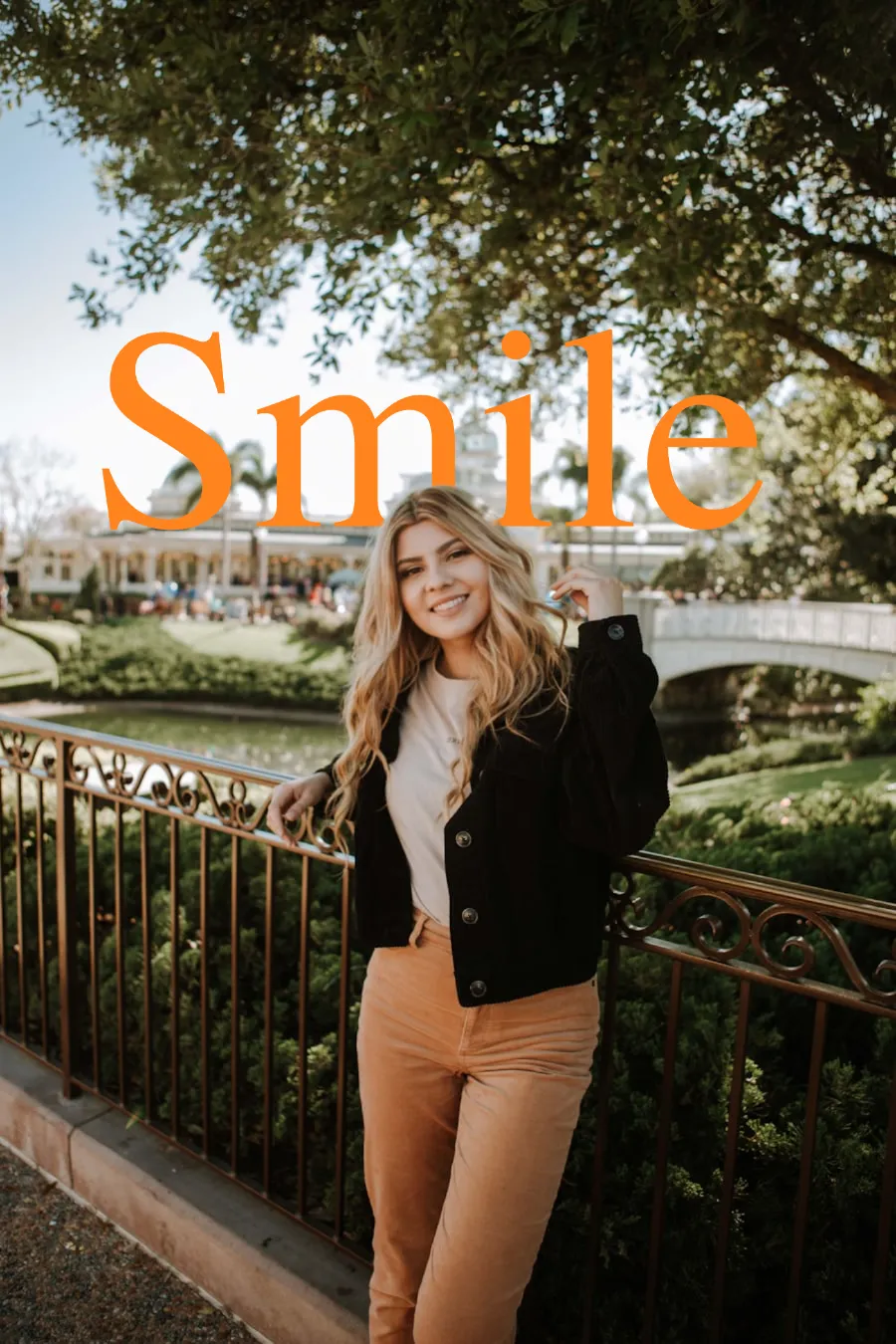
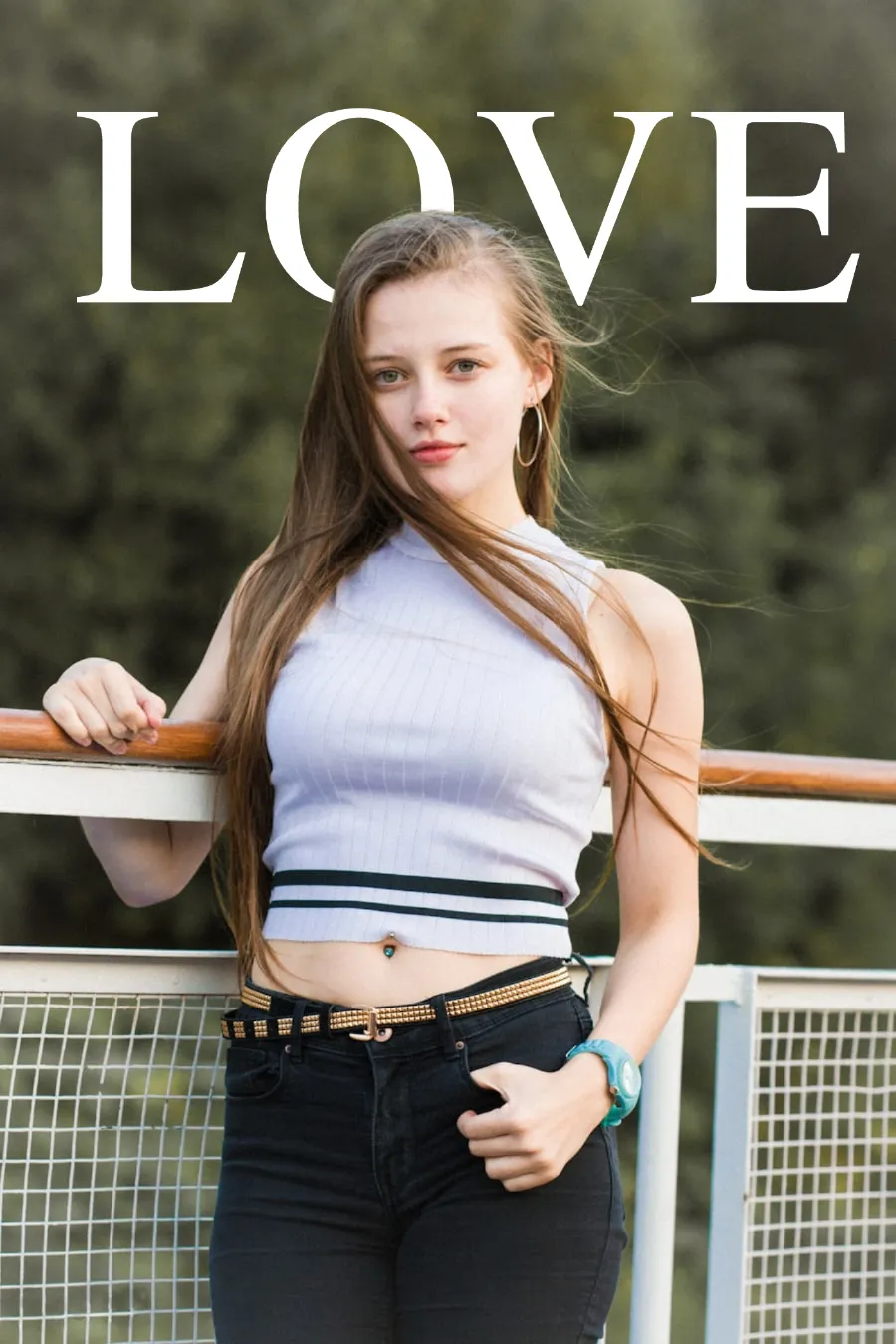
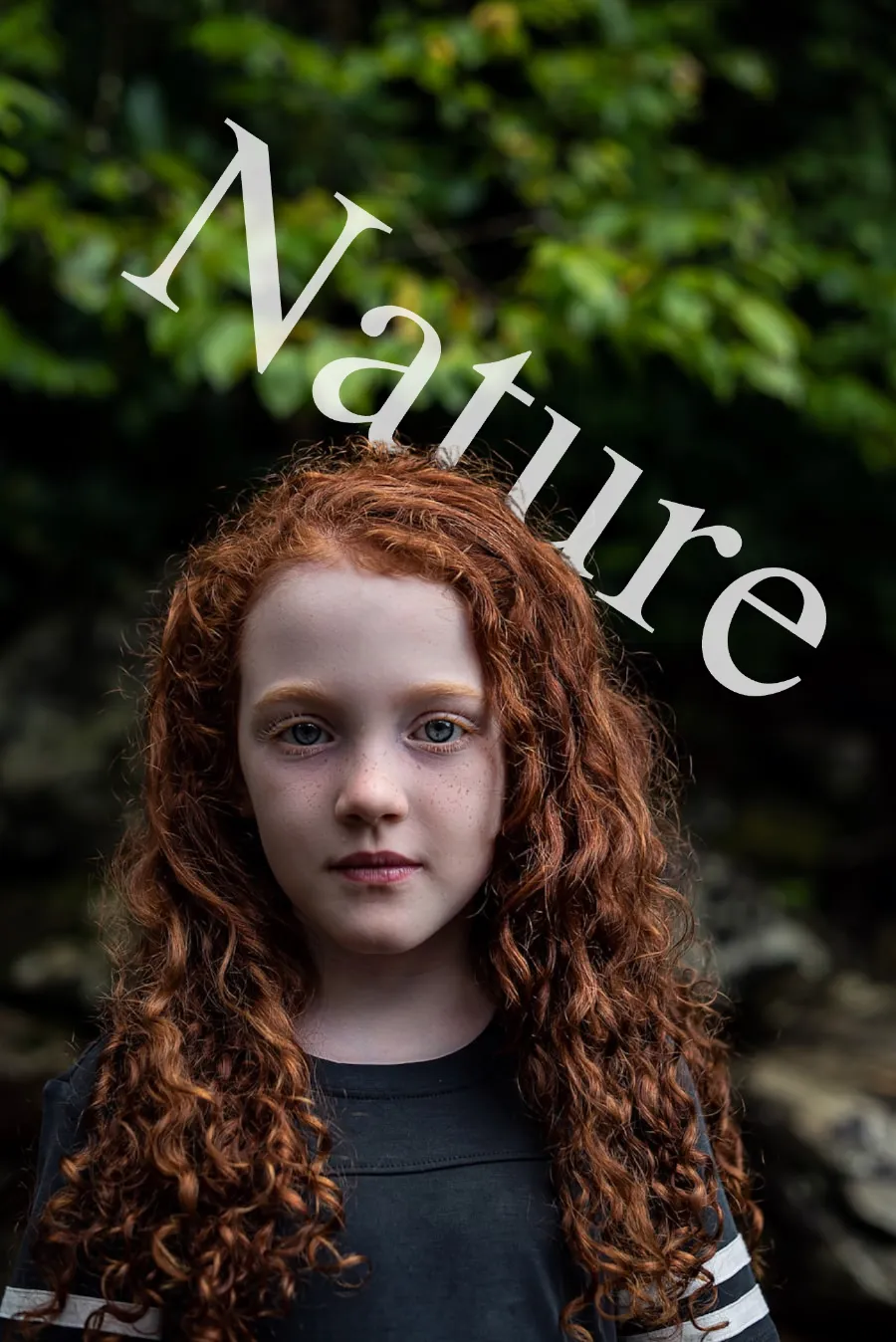
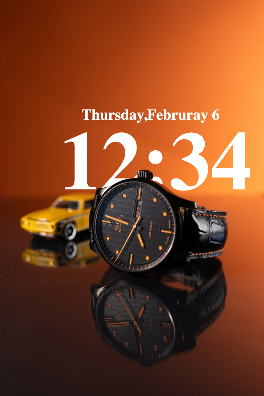
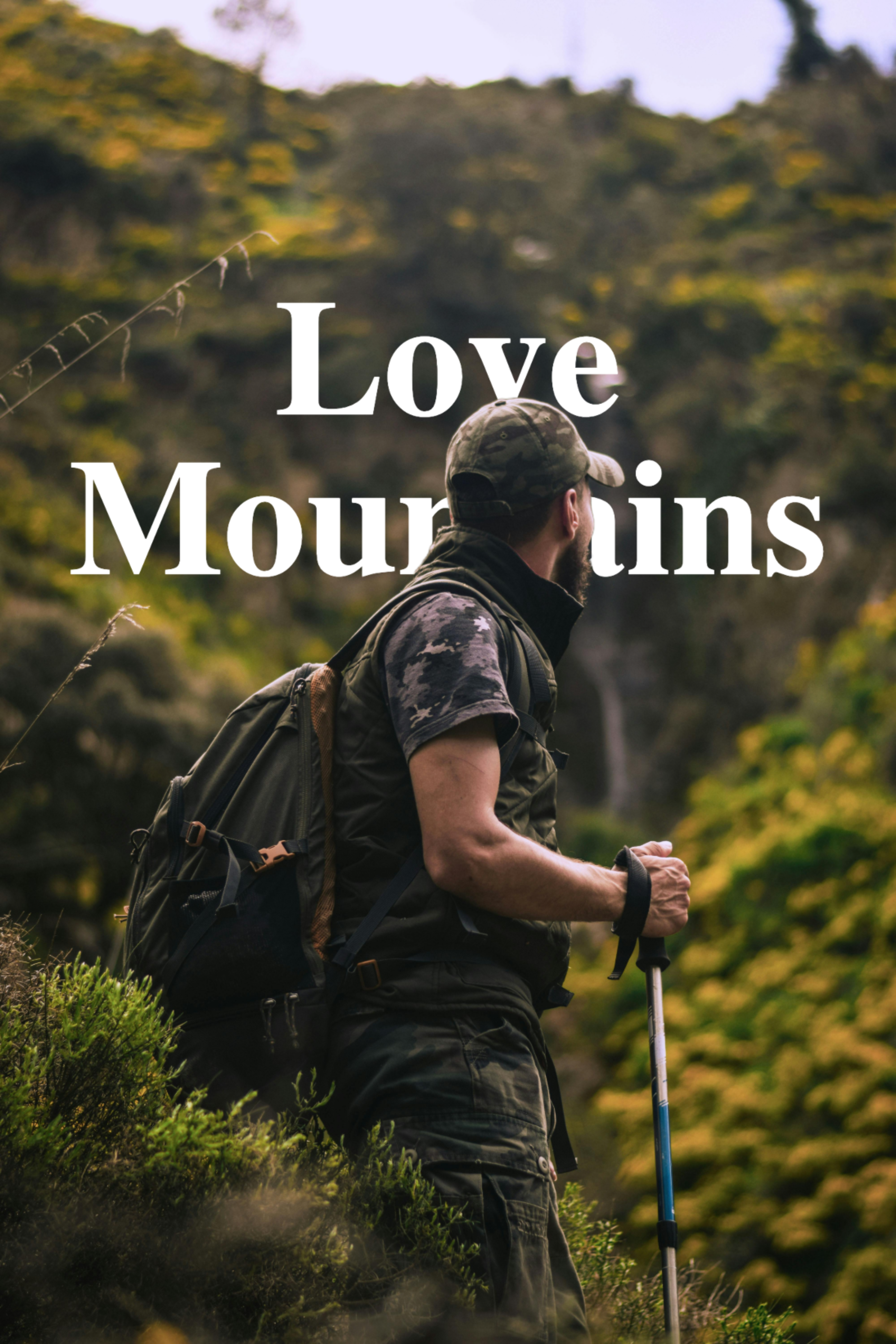
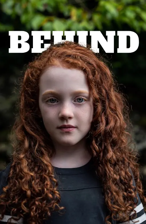
In the Overlay Mode option, switch to Behind. Your text now sits behind the subject in the photo. Drag it to the position you want — behind the shoulders, across the middle, or wherever it looks best. Add a shadow or glow effect to make it pop.
Use the filter controls to fine-tune brightness and contrast until the pin looks just right. Then click Download. The image saves to your device as JPEG or PNG with no watermark. It is ready to upload to Pinterest.
What is TextBehindImg?
TextBehindImg is a free tool that helps you make Pinterest pins where the text sits behind the person or object in your photo. Upload your image, type your text, and the AI handles the rest. It separates the subject from the background so the text looks like it goes behind them. No design skills needed. No signup. No watermark. Your pin is ready to download in under two minutes.
Upload any photo and the AI figures out what the main subject is — a person, a product, a flower, or anything else. It separates the subject from the background on its own. You do not have to draw around anything or use a selection tool. The text goes behind the subject automatically.
Pick from 36 presets that are already styled and ready to use. Each one has a font, color, and look that works well on Pinterest. Try Neon for a bright pop of color, Vintage for a warm soft feel, or Minimal for clean simple pins. One click and your text is fully styled.
Choose from over 150 Google Fonts to get the exact look you want. Thin and elegant, bold and loud, or fun and playful — they are all here. Change the size, spacing, and color to match your brand or the mood of your pin.
Add effects like 3D Shadow, Neon Glow, Cinematic, or Fire to make your text look more eye-catching. Pinterest is a visual platform and a strong text effect can be the difference between a pin someone scrolls past and one they stop to save. One click adds the effect.
Use the filter tabs to brighten the subject or darken the background. This makes the person or object stand out more against the text. You can adjust each layer on its own so the final pin looks balanced and professional.
Download your finished Pinterest pin as PNG or JPEG at full quality. There is no watermark on the image. You do not need to create an account or pay anything. Make as many pins as you want. Your photos never leave your device.
Pinterest is a place where people scroll fast and save what catches their eye. A pin with text behind the subject looks different from a regular text overlay. Instead of text just sitting on top of the photo, it looks like it is part of the scene. The person or object appears to be in front of the words. This creates a sense of depth that makes the pin look more designed and more interesting.
When someone is scrolling through hundreds of pins, this effect makes yours stop them. It signals that the creator put effort into the design. On Pinterest, that matters because saved pins get shown to more people. A pin that gets saved a lot is treated as a high-quality pin by Pinterest's system, so it gets shown to even more users over time.
Using the right size is one of the easiest things you can do to improve how your pins perform.
The text on a Pinterest pin needs to do two things: look good and be easy to read fast. Here are some tips that help with both.
Keep it short. Three to seven words is ideal for a pin headline. People scroll quickly and will not stop to read a long sentence. Your text should tell them what the pin is about in a glance.
Use big text. Pinterest pins appear in a column that is not very wide on most screens. Text that looks a good size on your desktop may be too small to read on a phone. Make the font size bigger than you think you need.
Pick high-contrast colors. White text on a dark subject, or dark text on a light background, is the easiest to read. Avoid colors that blend into the photo behind the text.
Bold fonts win. Thin fonts look elegant close up but disappear at thumbnail size. Use bold or extra-bold weights for anything that needs to be read clearly in the feed.
The text-behind effect shows up across many different types of Pinterest content. Here are the most common uses.
If you use Pinterest for a business or blog, your pins should look consistent so people recognize them. Here are some simple ways to keep your pins on-brand.
Use the same fonts every time. Pick one or two fonts and stick with them. People will start to recognize your style after seeing a few of your pins. You can save your favorite font choices as text layers and reuse them.
Use your brand colors. The text color is the easiest place to add your brand color. Even if the photo changes every time, the same text color ties your pins together visually.
Keep the text in the same spot. Placing the text in a consistent position — like always across the lower third of the photo — gives your pins a signature look. Viewers who see your pins often will start to recognize the layout before they even read the text.
Add your website or handle. A small second text layer with your website URL or Pinterest handle is a simple way to brand your pins. Put it in a corner where it does not compete with the main text.
Save TextBehindImg
Press Ctrl+D (or ⌘D on Mac) to bookmark and come back anytime it's free forever.