Scroll the preset bar at the top and click any style to load it instantly. Neon Glow, Fire, Gold, Vaporwave, Cyberpunk — each preset is a complete ready-made design. If you want to start from scratch, just ignore the presets and set everything yourself.
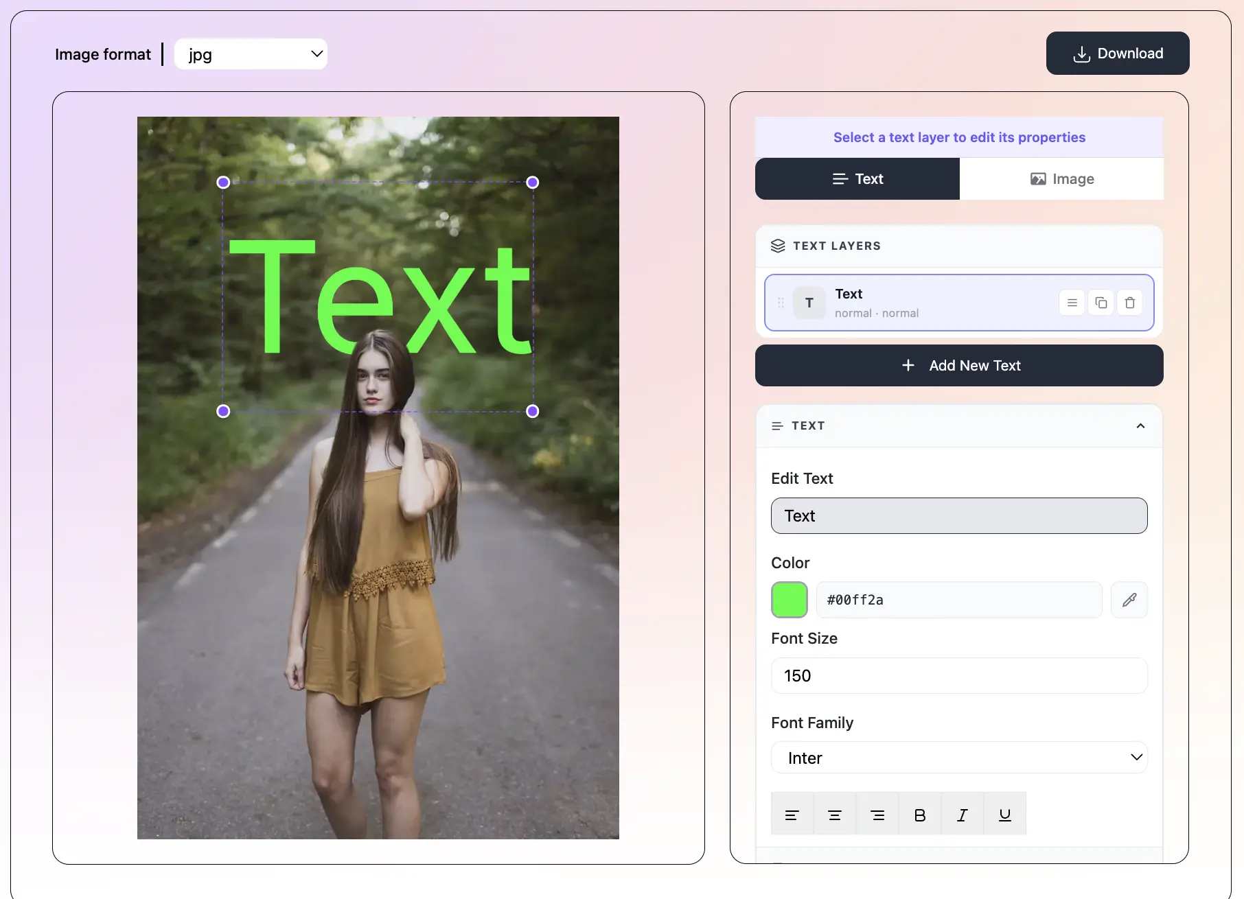
Type your words in the Text panel. Change the font, size, weight, and alignment. Go to Style to pick your color mode. Go to Effects to add glow, shadow, stroke, or 3D. Set a background in the BG panel — solid color, gradient, or your own photo. Drag the text anywhere on the canvas and resize it by dragging the corner handles.
Click the Download button above the canvas. A small menu will appear — choose PNG, JPG, JPEG, or WebP. Your image downloads at full resolution, clean and sharp, with no watermark. Ready to post on social media, use in a video thumbnail, or print.
What is Text to Image Maker?
Text to Image Maker is a free online tool that turns your words into a beautiful image. Type any text, pick a style, and your image is ready in seconds. You do not need design skills. You do not need an account. There is no watermark.
Choose from 47+ ready-made presets — Neon Glow, Fire, Ice, Gold, Matrix, Vaporwave, Cyberpunk, Galaxy, and many more. Change the font, colors, effects, and background. Set any canvas size — Instagram square, YouTube thumbnail, TikTok story, or your own custom size. Then download as PNG, JPG, JPEG, or WebP in one click. Everything runs right in your browser. Nothing is uploaded to any server.
Start from a complete ready-made design with one click. Neon Glow, Fire, Ice, Gold, Matrix, Vaporwave, Cyberpunk, Galaxy, Rainbow, Retro, Chrome — 47+ presets to choose from. Each one is fully customizable after you load it.
Style your text exactly how you want it. Pick a solid color, a smooth gradient, full rainbow, or set a different color for each letter. You can also use word colors or outline-only mode. See every change live on the canvas.
Add neon glow, drop shadow, stroke outline, 3D extrude, bubble effect, or a colored text background. Stack multiple effects together for a truly unique look. All effects are adjustable — color, size, intensity.
Pick from 150+ solid background colors or 40+ gradient presets. Or upload your own photo as the background. Adjust the blur and add a dark overlay to make your text stand out against any image.
Choose a preset size: Instagram Square (1080×1080), YouTube Thumbnail (1280×720), TikTok Story (1080×1920), Twitter Header (1500×500), and more. Or type your own width and height. The layout adjusts automatically.
This tool is completely free. No account. No subscription. No watermark on your downloads. All the work happens in your browser — your text and photos never go to any server.
A text image is any picture where the text itself is the main design. You see them everywhere. Here are some of the most popular things people make with this tool:
Starting from a preset is the fastest way to get a great-looking image. Each preset is a complete design — font, colors, effects, and background are all set for you. Just type your text and you are done. Here is a quick guide to what each category of preset is good for:
Neon and Glow presets (Neon Glow, Neon Sign, Neon Light, Year 3000, Dazzle) work great for gaming content, YouTube thumbnails, music graphics, and anything that needs energy and excitement. They use glowing, bright colors on dark backgrounds.
Bold and 3D presets (Pop 3D, Metal 3D, Emboss, Puffy) add depth and dimension to your text. They are great for titles, logos, and anything where you want the text to feel solid and powerful.
Light and clean presets (Minimal, Glossy, Outline, Label, Script Studio) are perfect for quotes, announcements, and content that needs to feel polished and professional. They use white or light backgrounds with subtle effects.
Retro and vintage presets (Retro, Vintage, Frozen, Chrome) have a classic look with aged colors and textures. Good for music content, art projects, and anything with a nostalgic feel.
Colorful and fun presets (Rainbow, Vaporwave, Colors Pop, Comic Style, Love It) use bright, bold colors. Perfect for fun social media content, kids' projects, and anything that needs to feel happy and energetic.
The effects in this text to image maker are what separate a plain text image from something that really grabs attention. Here is what each effect does and when to use it:
Neon Glow adds a soft, colorful light around your text, like a real neon sign. It is perfect for dark backgrounds. Turn the intensity up for a strong look, or keep it low for a subtle halo. You can set the glow color separately from the text color — try white glow on colored text for a sharp, clean neon effect.
Drop Shadow adds a shadow behind your text. This makes the text feel like it is lifted off the background. It also makes text easier to read on busy photo backgrounds. Adjust the offset (how far the shadow is from the text) and the blur (how soft the shadow edges are).
Stroke Outline draws a colored border around each letter. A thin white stroke on dark text — or a dark stroke on light text — makes letters look sharper and easier to read at small sizes. A thick, colorful stroke is a design choice in itself.
3D Extrude adds a three-dimensional block of color behind your text, making it look like the letters are carved from a block. It works best with thick, bold fonts. Adjust the depth (how thick the block is) and the angle (which direction the shadow falls).
Bubble adds a soft circular glow on each letter, giving the text a bubbly, slightly raised look. It pairs well with rounded fonts like Pacifico or Comfortaa.
Text Background places a colored label or box behind your text — like a highlight marker or a pill-shaped badge. Great for making text readable on complex backgrounds and for a clean, modern poster look.
The font you pick changes everything about how your text image feels. Here is a quick guide to the fonts in this tool:
Big and bold: Bebas Neue, Montserrat Black, Raleway, Oswald, Cinzel. These look great for titles, YouTube thumbnails, and anything where the text needs to feel strong and confident.
Script and handwritten: Pacifico, Dancing Script, Satisfy, Lobster, Permanent Marker. These feel personal and creative. Great for quotes, names, and social posts that need a human touch.
Techy and futuristic: Orbitron, Space Grotesk, Russo One, Press Start 2P. These are perfect for gaming content, sci-fi themes, and anything that needs to look high-tech.
Rounded and friendly: Fredoka One, Comfortaa, Lilita One, Righteous. These feel fun and approachable. Great for kids' content, positive quotes, and colorful designs.
For colors, you can choose from seven modes: solid (one color), gradient (a smooth blend between two or more colors), rainbow (automatic color cycling through every letter), custom per-character (you pick a different color for each letter), word colors (each word gets a different color), outline only (hollow letters with just a border), and gradient outline. The gradient editor lets you pick any start and end color, and you can angle the gradient in any direction.
Getting the size right is just as important as the design itself. The wrong size means your image looks cropped or blurry on the platform you post it to. Here are the sizes that matter most:
Here are some things that professional designers do when making text images. These small changes make a big difference:
Keep the text short. A text image works best when the words are easy to read in one glance. If you have a lot to say, pick the most important four or five words and make those the image. Put the rest in the caption.
Use contrast. Light text on a dark background, or dark text on a light background, is always the most readable combination. Avoid light text on a light background or dark text on a dark background — it is hard to read.
Match the font to the feeling. A bold blocky font feels strong and confident. A script font feels personal and creative. A techy font feels futuristic and cool. Pick the font that matches what your content is about.
Do not use too many effects at once. One or two effects look intentional. Five or six effects on the same text looks messy and hard to read. Pick your strongest effect and let it be the main thing.
Use the drag handle. After you set up your text, drag it around the canvas to find the best position. You can also resize it by dragging the corner handles. This lets you place the text exactly where it looks right, not just in the center.
Test on mobile. Most people will see your image on a phone. After you download it, open it on your phone and check that the text is easy to read at that size.
All free, no sign-up — same photo works across every tool
Save TextBehindImg
Press Ctrl+D (or ⌘D on Mac) to bookmark and come back anytime it's free forever.